Examples
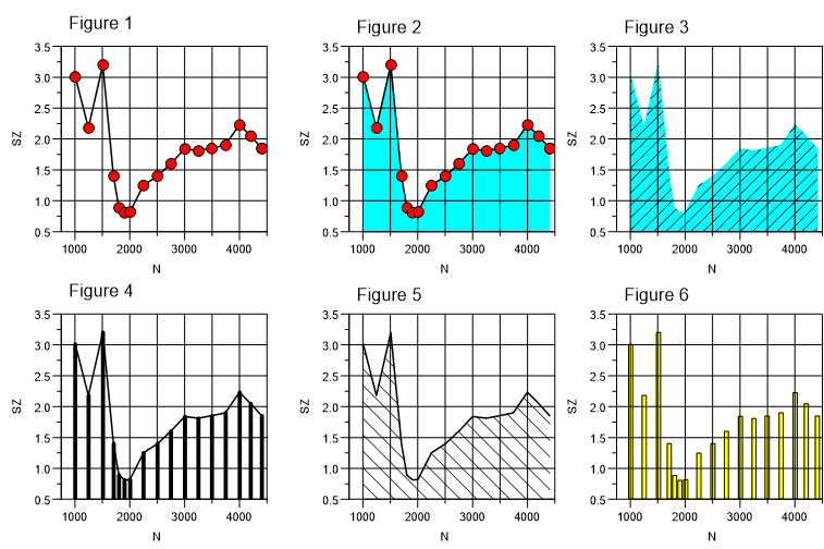
2D Dataset Attributes
- Click the curve to select the dataset and then choose the
2D Curve
 button from the toolbar, or
 - Double-click the curve, or
- Choose the Dataset List
 button from the toolbar, select
the name of the dataset and then choose the Configuration button to
open the 2D Curve dialog box.
button from the toolbar, select
the name of the dataset and then choose the Configuration button to
open the 2D Curve dialog box.
Diagram with 3 Overlapping y-axes
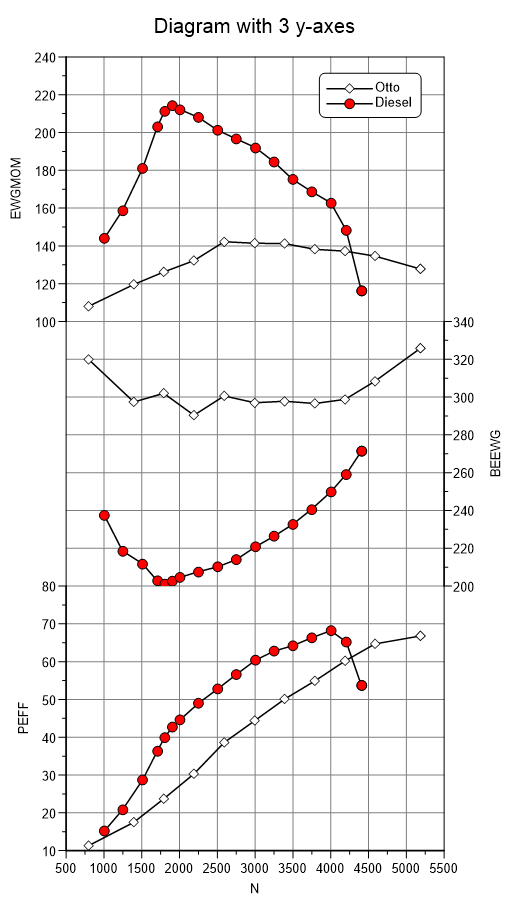
- Choose File=>New and select the diagram with the multiple y-axes option. In the following dialog box, choose 3 y-axes and then click OK. A diagram with one x-axis and three y-axes will be created.
- To import a dataset, select the lower diagram by clicking inside the diagram
frame. The selection will be displayed by blue handles at the diagram corners.
Choose File=>Import Data, open the file
VOLLAST.NC. In the Import dialog box, choose x =Nand y =PEFF. Make sure the Axes checkbox is selected and then choose the Load button. - Select another diagram, specify the next dataset and click Load.
- To create a square diagram grid, choose Diagram=>More Diagram Functions and then select Scale Axes for Square Grid. Click OK to execute the function.
2D Dataset - Derivation and Integration
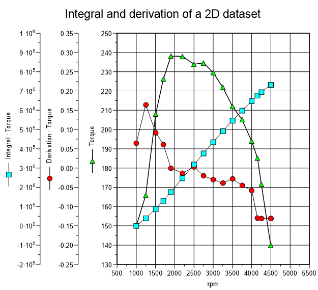
- Import the x =
Nand y =Mom2D dataset from thevollast.ncfile. - Choose Data=>More Data Functions and then select the Create Derivation Dataset option. A new diagram with a shifted y-axis and a hidden x-axis will be created.
- To create an integral dataset from the original (N, Mom) dataset, select the dataset and then choose Data=>Integral). Again, a new diagram with a shifted y- and a hidden x-axis will be created. However the y-axis will now overlap the y-axis from derivative diagram.
- To shift the axis more to the left, choose Diagram=>Layout and type in 4 (cm) for the y-axis distance.
- Choose data point symbols for the three datasets and then create a legend (Diagram=>More Diagram Functions and select Legend for 2D datasets, Create Legend for all Diagrams).
- Double-click the legend. Mark
@l{1.2, ..., 0.475}and copy (Ctrl+C) the selection into the clipboard. Close the dialog box and double-click the Mom axis title. Position the cursor at the beginning of the text and then press Ctrl+V to insert the clipboard contents.
Another way to display the marker in the y-title is to insert the field function @f{marker}. This function displays the marker from the first dataset in the diagram.
Diagram with 2 Curves and Color Filling
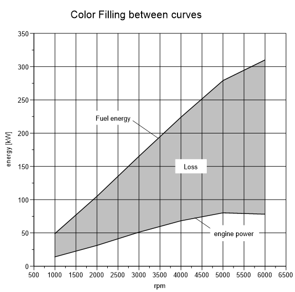
- Load the x = Drehzahl (rmp), y = Brennstoffenergie (fuel energy) 2D dataset
from the
ENERGIE.ASCfile in theUniPlot\Samplesdirectory. - Choose the 1D and 2D Dataset Configuration button from
the toolbar to open the 2D Dataset dialog box. Click the Fill Color check
box and then choose the OK button. The area under the curve should be color
filled down to the x-axis.
- Load another dataset from the ENERGIE file. Load the x =
Drehzahl, y =Nutzleistung2D dataset. - Choose the 2D Dataset button from the toolbar to open the dialog box. Click the Fill Color check box. Open the Fill Color dialog box and choose the color white, then click the OK button. The area under the curve should be color filled down to the x-axis.
Hatch Filling
To fill the area between two curves with a hatch do the following:
- Select the two curves. Click the first curve. To select the second curve hold down the Shift key while you click on the second curve.
- Choose Data=>More Data Functions and select Hatch Fill between two 2D datasets.
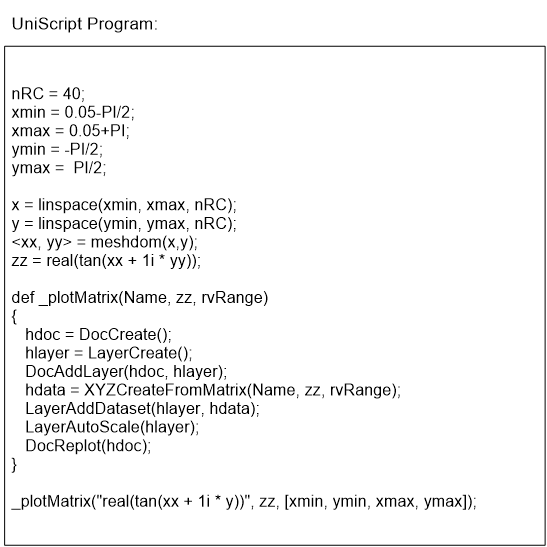
Plot a Function f(x)
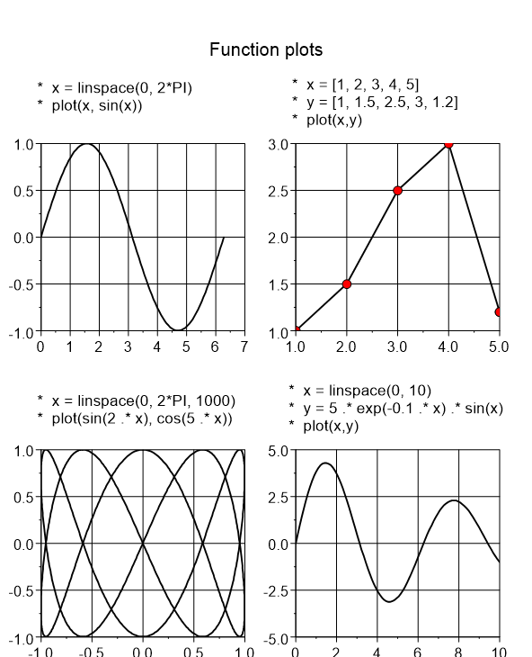
To plot one of these functions:
- Choose View=>Command Window or choose the UniScript
 button in the toolbar to open the UniScript command window.
 - Type in the program lines from to create the plot. The plot function will create a new document with a diagram and the dataset.
You can find more information about UniScript in the second part of this user manual.
Contour Diagram with Color Gradient and Legend
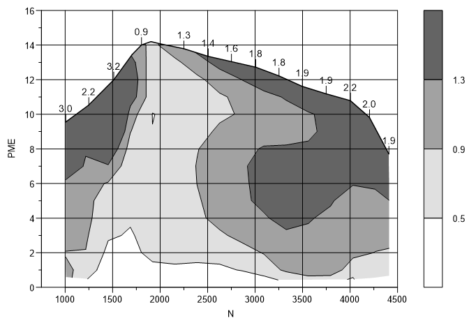
To open the
map2.ncdata file from theUniPlot\Samplesdirectory, choose File=>Import Data. Select the 3D option button and then selectN `` for the x-axis, ``PMEfor the y-axis andSZfor the z-axis. Make sure the Isolines and the Axes check boxes are marked and then choose the Load button.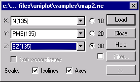
Double click an isoline to open the 3D dataset dialog box. Select all the isoline values in the list box and choose the Delete button to remove all the isoline values.
Type 0.5, 0.2, 1.5 into the text box and then choose the Insert button to add the values 0.5, 0.7, 0.9, 1.1, 1.3 and 1.5 to the list box. Select all values including the value min and click the Fill Color button to specify the color gradient.
Choose white (red=255, blue=255, green=255) for Minimum and black for Maximum (the color gradient will be displayed in the left box) and then choose the OK button.
In the 3D dataset dialog box, choose the Isoline tab and select the Color Filling Between Isolines check box and then choose the OK button.
To create a color legend, choose Data=>More Data Functions and select the Color Legend option. Then click the OK button.
Contour and 3D Diagram
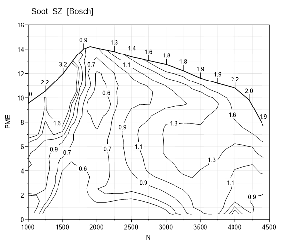
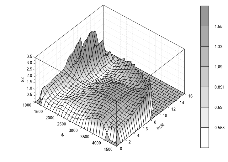
- Open the MAP2.NC data file and import the x = N, y = PME and z = SZ 3D dataset.
- To create a copy of the diagram, choose Edit=>Copy Diagram
- To insert the clipboard contents into the document, choose Edit=>Paste. The pasted diagram will be inserted at the same position as the original diagram.
- Select the copied diagram and move it to the lower area of the document. Choose the 3D button from the toolbar to change the diagram to a 3D diagram.
- To specify a color gradient for the surface map, choose the 3D Surface
 button from the toolbar. Then choose the 3D Surface tab
and select the Surface with Color Gradient option.
button from the toolbar. Then choose the 3D Surface tab
and select the Surface with Color Gradient option. - To create a color legend, choose Data=>More Data Functions. Select the Color Legend option from the list box.
Plot a Function f(x,y)
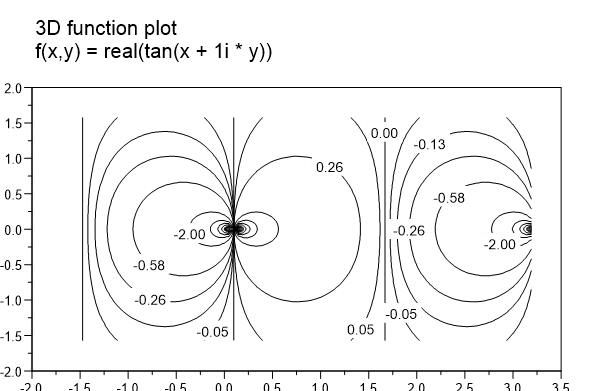
- To create a new editor, choose File=>New. Select the Editor option from the list box to create an empty editor.
- Type in the program code above.
- To execute the new program, choose UniScript=>Save/Execute. If you typed in the program correctly, a new document with an isoline diagram will be created. If an error occurs during the compilation process, correct the error and choose Save/Execute (F4) again.
To receive Help for a function, position the cursor on a function name and press F1. More information about using the program language UniScript is provided in second part of the manual.
Contour Cross-section
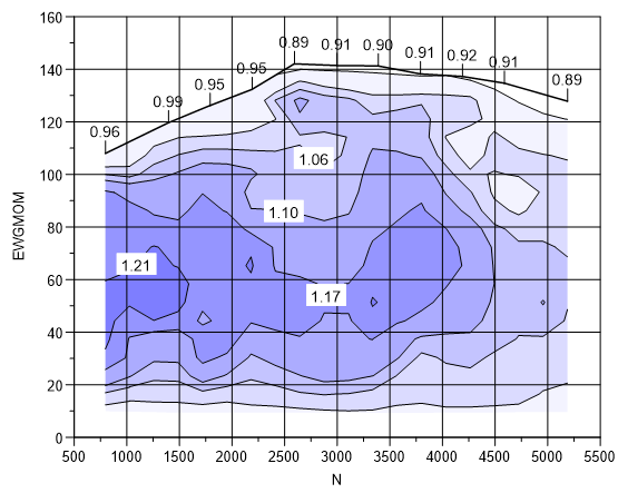
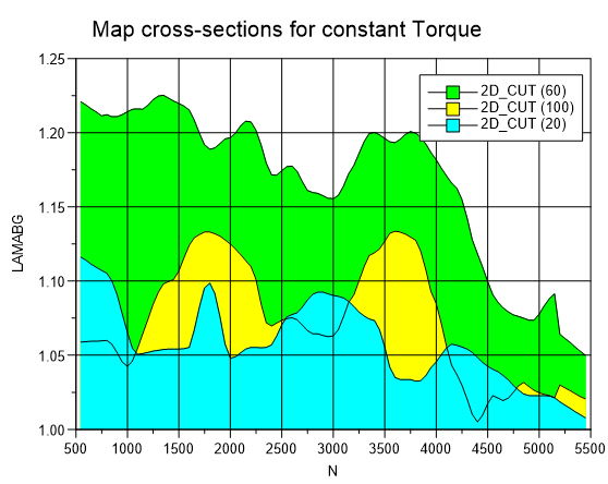
- Import a 3D dataset (x = N, y = EWGMOM, z = LAMAGB) (LAMABG = Lambda in
Exhaust) from the
KENNFELD.NCdata file. - Click one isoline to select the 3D dataset. Choose Data=>More Data Functions. Choose the function Cross-section for y = constant from the list box.
- In the following dialog box, some cross-section values will be displayed. Delete all values except 20;60;100 in the edit field. The values must be separated by one semi-colon. No separator should be placed in front of the first and after the last value.
A new document will be created with cross-section lines for the values 20, 60, and 100 Nm.
In the next step, we want to create a copy of the diagram with the contour map into the document.
- Choose Edit=>Copy Diagram. The diagram, the datasets and the legend will be copied to the clipboard.
- Select the document with the contour map. Choose the name of the document from the Window menu.
- Insert the diagram from the clipboard into the document. Choose Edit=>Paste.
- Move the diagram to the lower part of the document.
Cross-section along a 2D Curve
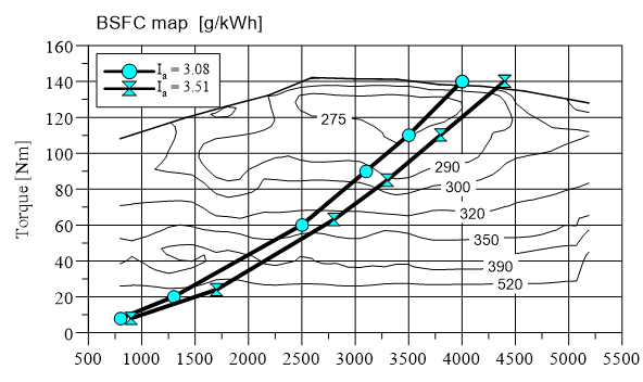
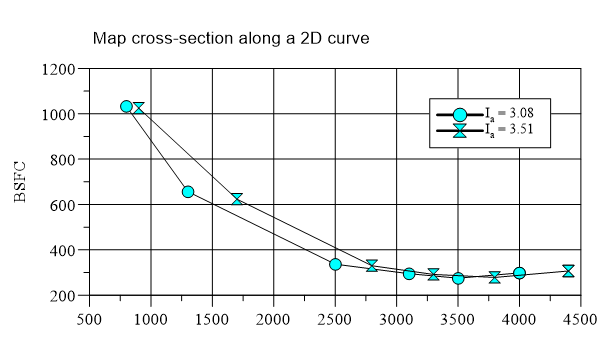
To create a cross-section along a curve in the x/y plane, a 2D dataset is necessary. For every data point, a z-value will be computed from the contour map. The z-values can be plotted as a x/z-, a y/z-curve or the z-values can be plotted over the arc length.
In the example, the cross-section was computed along the driving resistance curve in a fuel consumption map.
To create the cross-section, load the (UniPlot\Samples\Sample.ipw)
example file and repeat the steps from the previous example.
id-1530564